8天让iOS开发者上手Flutter之二
Flutter布局
Alignment
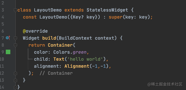
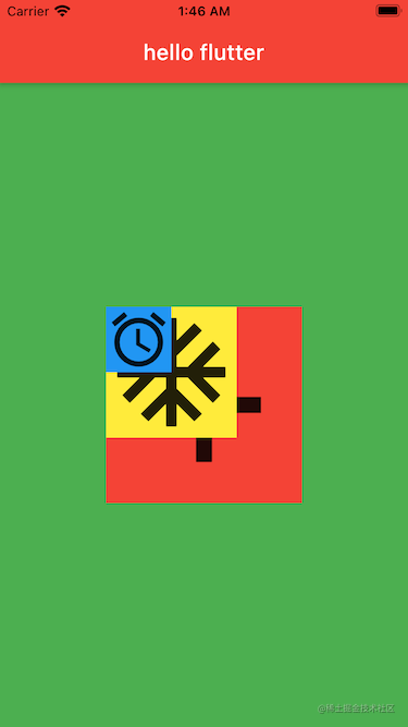
Container 类里有一个 alignment 属性,翻译过来应该叫对齐方式,这个属性用来控制 Container 的子控件相对于它自身的一个位置。在我们 iOS 开发中,我们知道坐标系的原点是在左上角。
而在 flutter 中,坐标系的原点在父控件的正中心,可以使用这个 alignment 属性来控制子控件在父控件中的位置,它有两个参数分别是 double 类型的 x,y。取值是 -1 到 1,
- 当 (0, 0) 的时候表示子控件在父控件的正中心,当 (1, 0) 的时候,表示子控件位于 x 方向上的最右侧,y 方向上居中;
- 当 (-1, -1) 的时候,表示子控件位于父控件的左上角位置。有点类似于 CALayer 的 anchorPoint 属性。
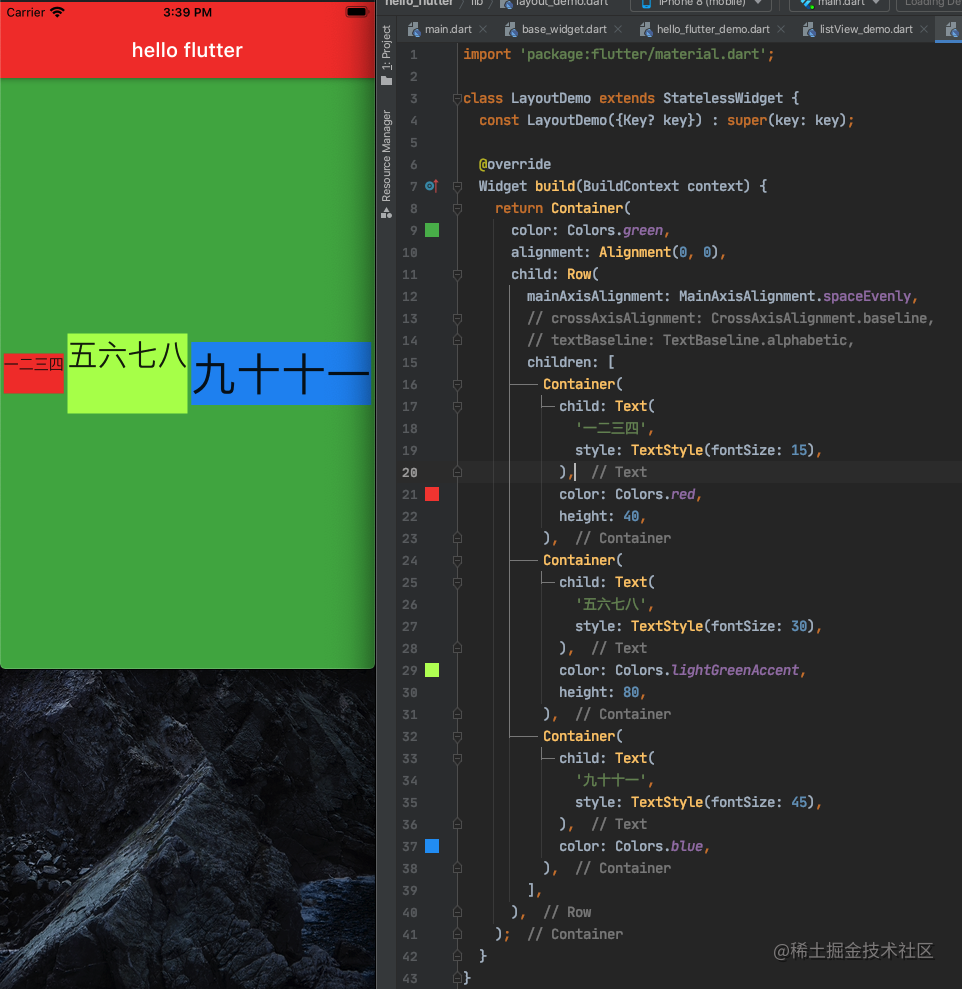
如图代码如下:
Row
Row 表示水平布局,它有一个 children 属性,用来存放它的子控件。代码如下:
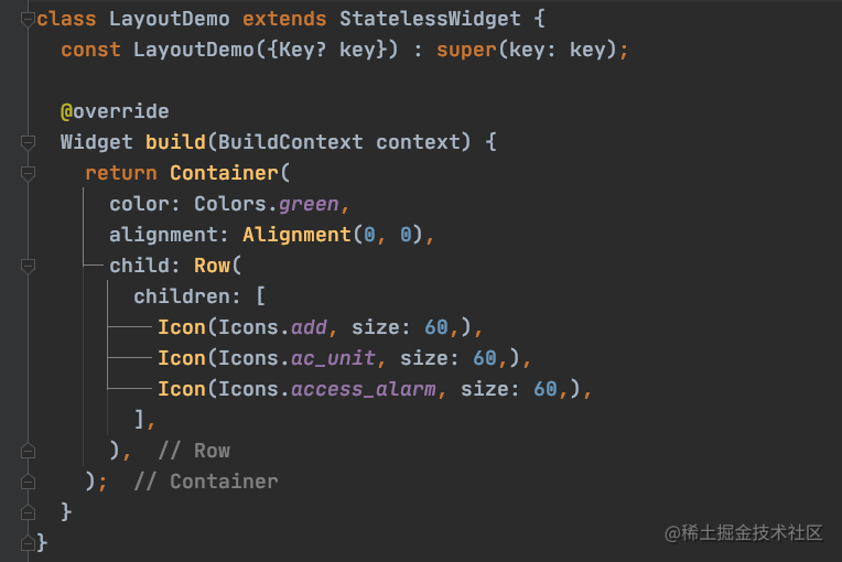
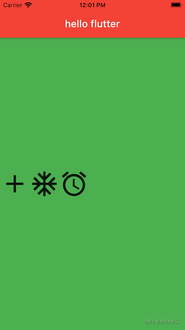
其中 Icon 类是 flutter 提供的一个快速创建一些常用图标的类。如果想给每个 Icon 都加一个背景色,直接设置 Icon 的 color 是不行的,这样修改的是图标的颜色而不是背景色,给 Icon 包一层 Container 容器,然后再设置 Container 颜色这样就可以实现了。
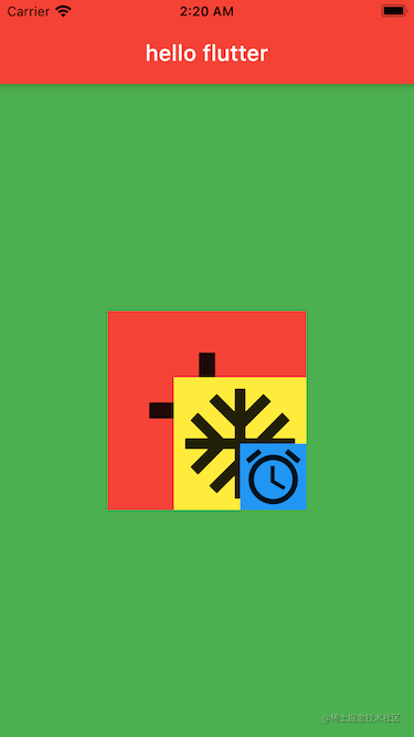
最开始我们尝试了 alignment 属性的作用,当它是 (0,0) 的时候,Text 的位置默认是在屏幕中央的。为什么这里换成我们的 Row 之后,Row 的子控件位置不在屏幕中央呢?
mainAxisAlignment
Row 和 Column 都有一个 mainAxisAlignment 属性,叫作主轴对齐方式,默认是 MainAxisAlignment.start 意思沿着主轴方向开始,Row 布局下就是从左至右,Column 布局下就是从上至下。
MainAxisAlignment.spaceAround:将剩下的空间平均分配MainAxisAlignment.spaceBetween:将剩下的空间分配到子控件之间MainAxisAlignment.spaceEvenly:等间距分配子控件
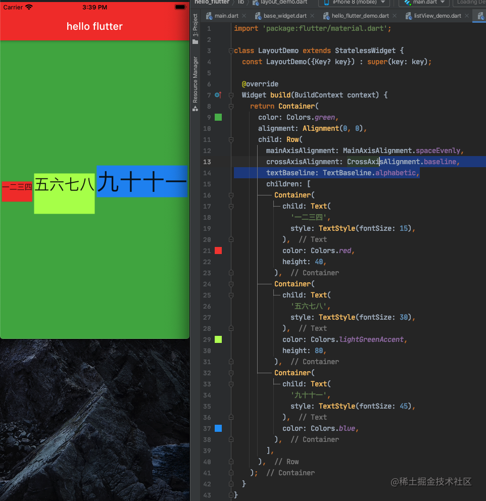
crossAxisAlignment
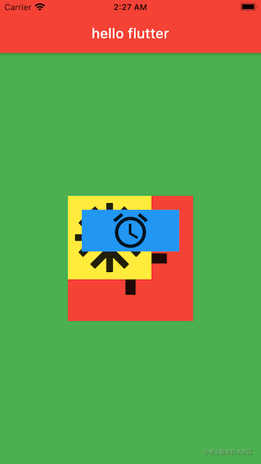
交叉轴对齐方式。start,end,center 这几种方式试一下很好理解,stretch 会将子控件拉伸。而 baseline 用的比较少,单独使用它会报错,需要和 Text 文本结合,还需要配合 textBaseline 属性一起使用。如下图所示,如果不设置 CrossAxisAlignment.baseline 和 TextBaseline.alphabetic 就会根据控件高度水平对齐,而如果设置了就会根据控件内文本的基线对齐。
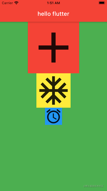
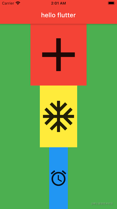
Column
这个和 Row 是对应的,Row 是水平布局,这个 Column 是垂直布局
1 | class LayoutDemo extends StatelessWidget { |
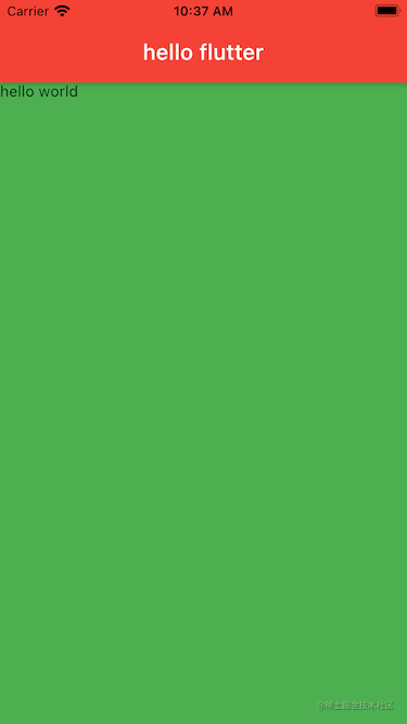
显示效果如图:
mainAxisAlignment
这个跟 Row 类似
crossAxisAlignment
这个跟 Row 类似
Stack
这个是用在 Z 轴上的布局的,row 是 X 轴,column 是 Y 轴。children 数组第一个放在最底部,最后一个放在上面,离用户最近的地方。
1 | class LayoutDemo extends StatelessWidget { |
APP显示效果:
alignment
Stack 里有一个 alignment 属性,它用来控制所有子控件相对于最大那个子控件的位置
1 | class StackDemo extends StatelessWidget { |
Positioned
Stack 里配合 Positioned 类使用的话,跟我们 iOS 的约束有点类似了,可以设置上,左间距之类的
1 | class StackDemo extends StatelessWidget { |
可以看到最小的蓝色视图的上左右均设置了 20 的间距,是不是熟悉的约束味道。。。
Expanded
Expanded 是一个类似 Container 的常用的布局容器,它用来填充布局,使用了填充布局在主轴方向上是不会有间隔的,所以 Expanded 用在 Row 里面的时候,子控件的宽度设置就没有意义了,而在 Column 里面使用的使用,子控件的高度设置就没有意义了。这里以 Column 为例:
1 | class LayoutDemo extends StatelessWidget { |
AspectRatio
AspectRatio 是一个容器类,它有一个属性 aspectRatio 表示宽高比。如果指定了宽度,根据这个 aspectRatio 可以自动算出高度;如果指定了高度,根据 aspectRatio 可以自动算出宽度。如下面代码指定了父视图高度为 100,aspectRatio 宽高比为 2,子视图宽度就是 200,再把父视图撑起来也是 200。
1 | class LayoutDemo extends StatelessWidget { |
Flutter状态管理
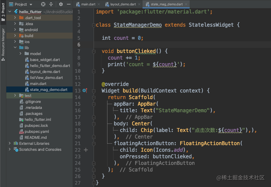
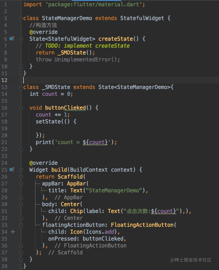
之前介绍的这么多类都是无状态的,意思是显示之后没办法更新 UI 的,如果想要实时更新 UI 的话,就不能继承无状态的类了。我们先来看一个例子:明明 count 变化了,但是界面显示没有变化
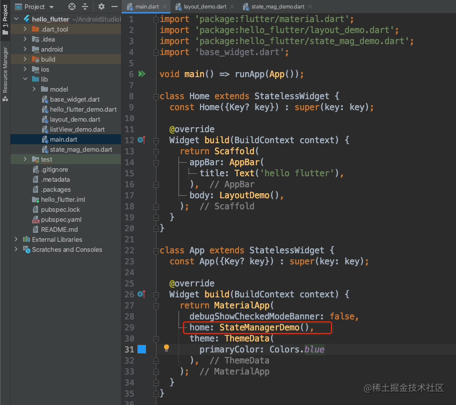
记得修改 APP 的 home 视图
然后点击屏幕右下角的加号按钮,可以发现明明控制台打印了 count 的值已经发生了变化,但是界面显示依然是 0
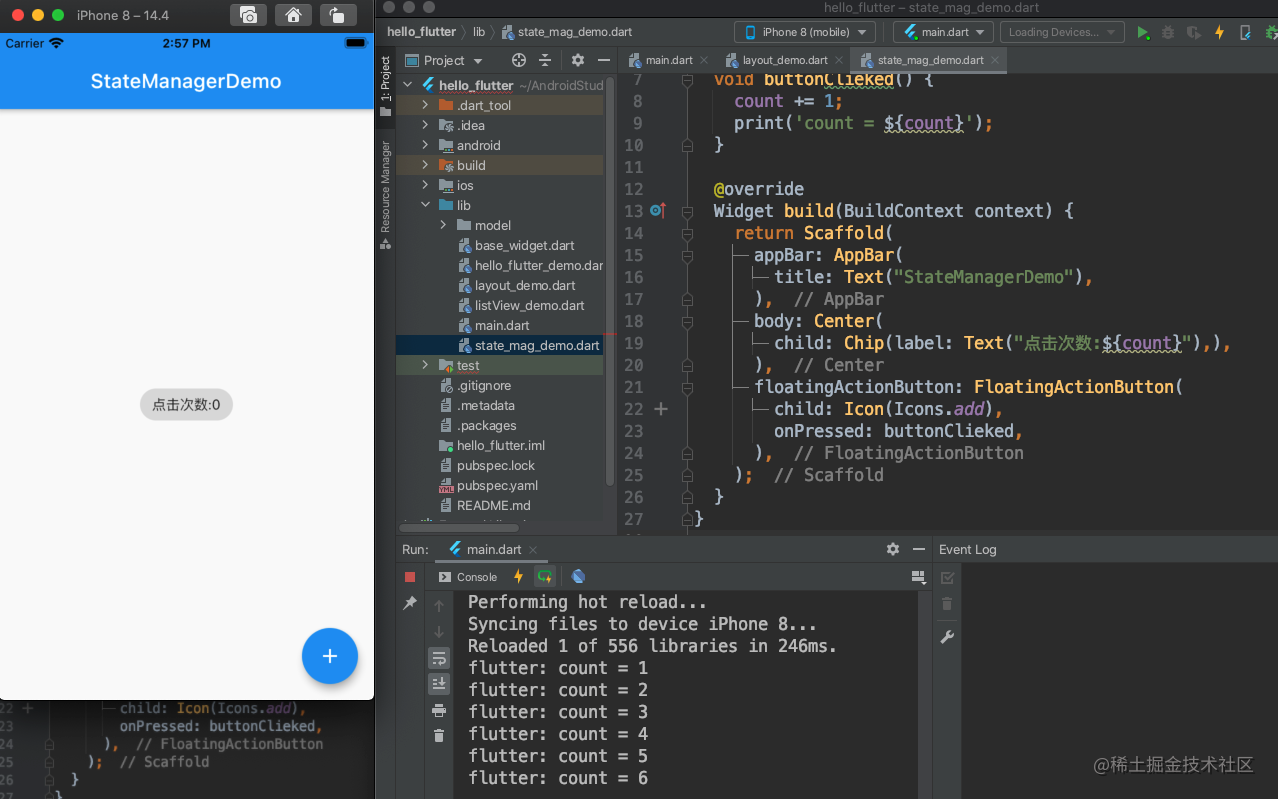
下面我们解决这个问题,将 StateManagerDemo 继承改为 StatefulWidget,实现 createState 方法返回一个自定义的 State 对象,自定义的 State 对象里面实现 build 方法。还需要注意在按钮的点击方法里调用一下 setState 方法。这样每次点击加号按钮就能实时更新 UI 了。改造完之后如下图所示:
项目搭建之底部TabBar
到目前为止,我们对 flutter 的一些基础知识就算是介绍的差不多了。接下来我们开始做一个简单的仿微信 APP。我们应该都有经验,理论的知识学得再多,不动手开始敲代码,不在项目中运用,是很难真正掌握一门知识的。
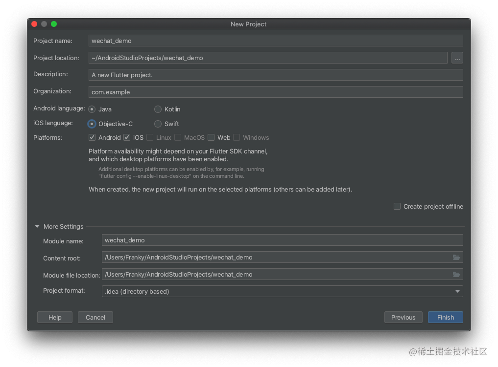
新建一个 flutter 工程,命名 wechat_demo:
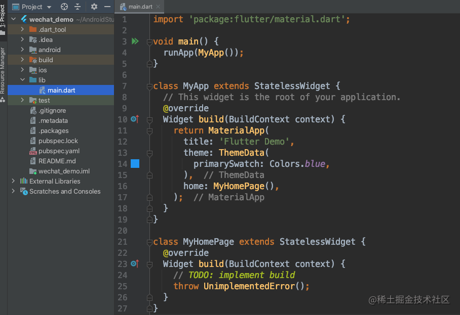
删掉多余的代码,可以全部重新自己写:
创建底部的 TabBar 和 item,默认的 type 是白色的,显示效果很难看所以改为 fixed,还可以设置 fixedColor:
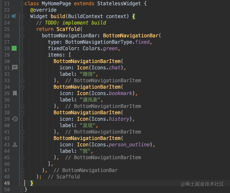
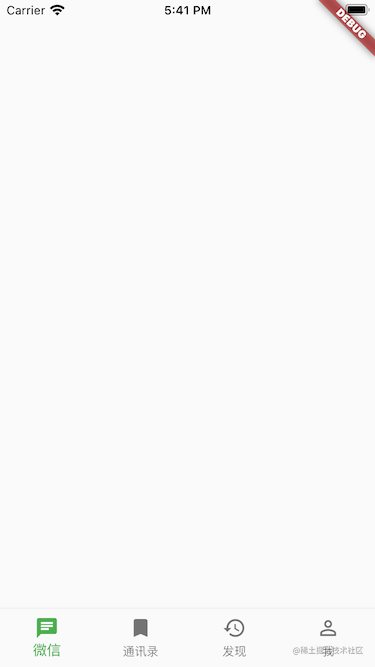
这样底部的 TabBar 就显示出来了,会发现点击没有效果,对比 iOS 会发现这块地方还是 iOS 提供的 UITabBarController 封装的更舒服,每个平台都各有优劣吧。
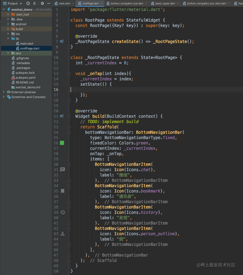
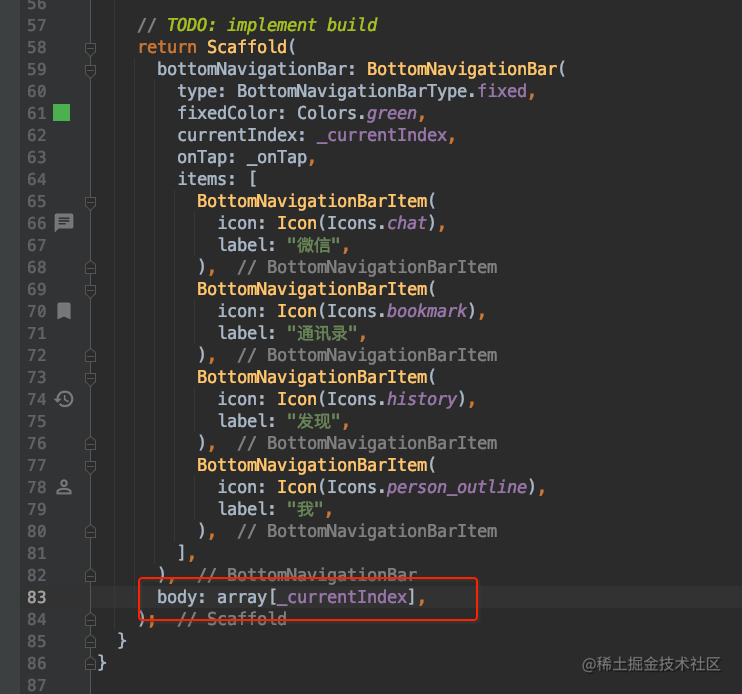
BottomNavigationBar 有一个属性 currentIndex 即代表了当前选中的下标。我们可以通过设置它的值来控制哪个按钮被选中。既然需要改变 UI 了,说明我们需要将 StatelessWidget 改为 StatefulWidget 了。还有一个参数 onTap 是用来回调点击事件的。实现点击事件,切换 currentIndex,重新 setState 就可以实现,点击切换了。我们将 bottomNavigationBar 相关代码放到一个新的文件 rootPage 中。代码如下:
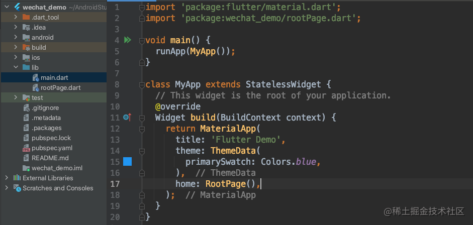
记得修改 main.dart 文件中
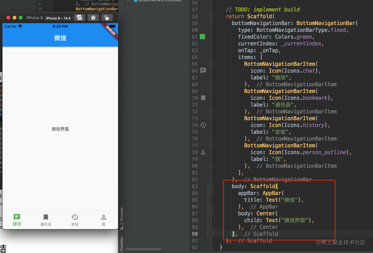
这样就实现了 APP 的底部 TabBar 的展示,点击功能。点击每个 item 的时候,会发现 flutter 的 bottomNavigationBar 还自带了动画效果…
我们知道 Scaffold 还有一个 body 的属性,表示展示在屏幕上的内容。我们每个 item 对应的界面都需要一个 AppBar,那么也许意味着,body 属性还需要一个 Scaffold 来展示我们的每个 item 对应的内容。
可以看到微信首页就已经大概出来了,但是点击的时候只会显示这个微信页面,怎么实现切换不同的页面呢,肯定需要一个数组,来存放对应的每个页面了。
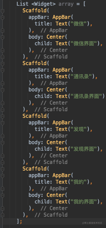
然后 body 里,根据我们的 _currentIndex 返回对应的 body
这样点击每个 item 都会跳转到对应的界面了,APP 的主框架的搭建好了。
总结
今天主要讲了 flutter 的三大布局类 Row,Column,Stack 以及他们的一些属性。然后是有状态的 Widget 和无状态的 Widget,最后搭建了一下我们要做的仿微信 APP 的底部 bottomNavigationBar 和切换页面功能